Development Log
Nice to Meet You, Space Cowboy
It's taken longer than expected, but I've finally reached the point in my translation project where I'm thinking about how I'm going to deliver it.
To recap, I am currently translating a book called Talk About Cowboy Bebop from Japanese to English for a client. I decided to take the project on because it seemed like a good way to prepare myself to take the JLPT exam down the line. The book is a collection of essays written by three Japanese cultural critics about the series, focusing on the story's themes and the construction of the series' world. The book has never received an official translation, so it seemed like an exciting challenge, though I knew at the time that it was a bit beyond my abilities.
Anyway, I'd been struggling with how I was going to deliver the finished product. Would I just send him a link to a Google Doc or would I attempt to print a several-hundred-page book using my $40 printer? I was at a loss...
... and then I remembered that I'm a UX designer.
And so I've decided to deliver this project as a website. In many ways, this project has become the culmination of my interests over the last few decades. Long before I was studying Japanese, I spent my time building and reading anime websites. Even now, I look back on the days of Geocities and Tripod sites and long for the romanticism of those early days of the internet. Even if 75% of the information on those sites ended up being wrong because it turns out that the early generation of anime fans (and more importantly fansubbers) didn't actually know any Japanese. One of the reasons I began studying the language was to figure out what was actually being said and written in my favorite series.
And thus, this project will be my way of honoring those Web 1.0 sites that captivated and inspired me as a kid. Except I actually know (enough) Japanese to know what I'm doing.
I'm still working on the translation and need to sit down and start sketching my ideas for this site, but I am excited that I can finally announce it and can't wait to share my work with everyone!
Until then,
See You, Space Cowboy
talk about the visual design
Ideally, you'd just tear the book apart, scan each page, and then replace the Japanese text with English. That's how fan translations are usually done (Trivia: This kind of translation is known as a "scanslation"). One problem: It's not my book to destroy.
Plus, once I decided to build a website, it wouldn't make a lot of sense to go through all of that effort. Of course, the downside was that I didn't have any access to the images in the book. In addition to character and mechanical line art, the book's essays are also peppered with screenshots, and captions, that provide additional context and information. Thankfully, most of the captions didn't require their corresponding images to make sense, meaning that the loss of these screenshots wouldn't compromise the quality of the translation. The fact that most of the line art has been published elsewhere was also a huge boon.
Now comes the challenge: Despite being unable to use the book's visual assets, I still wanted the website's visual style to match the book's.
There are a few reasons for this, but the biggest factor is that I believe that a translation ought to be as faithful to the original as possible. Naturally, a translation will always differ from the original. That's unavoidable because a translation is, by nature, an interpretation. No matter how hard you try to capture the original, something will always be lost. And when you factor in the space constraints that print translations face, you end up losing even more. That can leave you holding on to whatever you can retain for dear life.
My client asked me to be as thorough and accurate as I could. Why wouldn't that also apply to the visual design? After all, someone spent time creating the book's layout and graphics. And in order to maximize the reader's experience, I would need an engaging and accessible layout anyway.
Typography
Since the translation was going to be hosted on my portfolio site, I wanted continuity with my UX portfolio. In order to accomplish this, the translation's site uses the same typography system as my main site's.
Visual Design
Lorem ipsum dolor sit amet, consectetur adipiscing elit. Suspendisse varius enim in eros elementum tristique. Duis cursus, mi quis viverra ornare, eros dolor interdum nulla, ut commodo diam libero vitae erat. Aenean faucibus nibh et justo cursus id rutrum lorem imperdiet. Nunc ut sem vitae risus tristique posuere.


Background Image
Lorem ipsum dolor sit amet, consectetur adipiscing elit. Suspendisse varius enim in eros elementum tristique. Duis cursus, mi quis viverra ornare, eros dolor interdum nulla, ut commodo diam libero vitae erat. Aenean faucibus nibh et justo cursus id rutrum lorem imperdiet. Nunc ut sem vitae risus tristique posuere.

Case Study
talk about the challenge
Talk About Cowboy Bebop is a perfect title for this book.
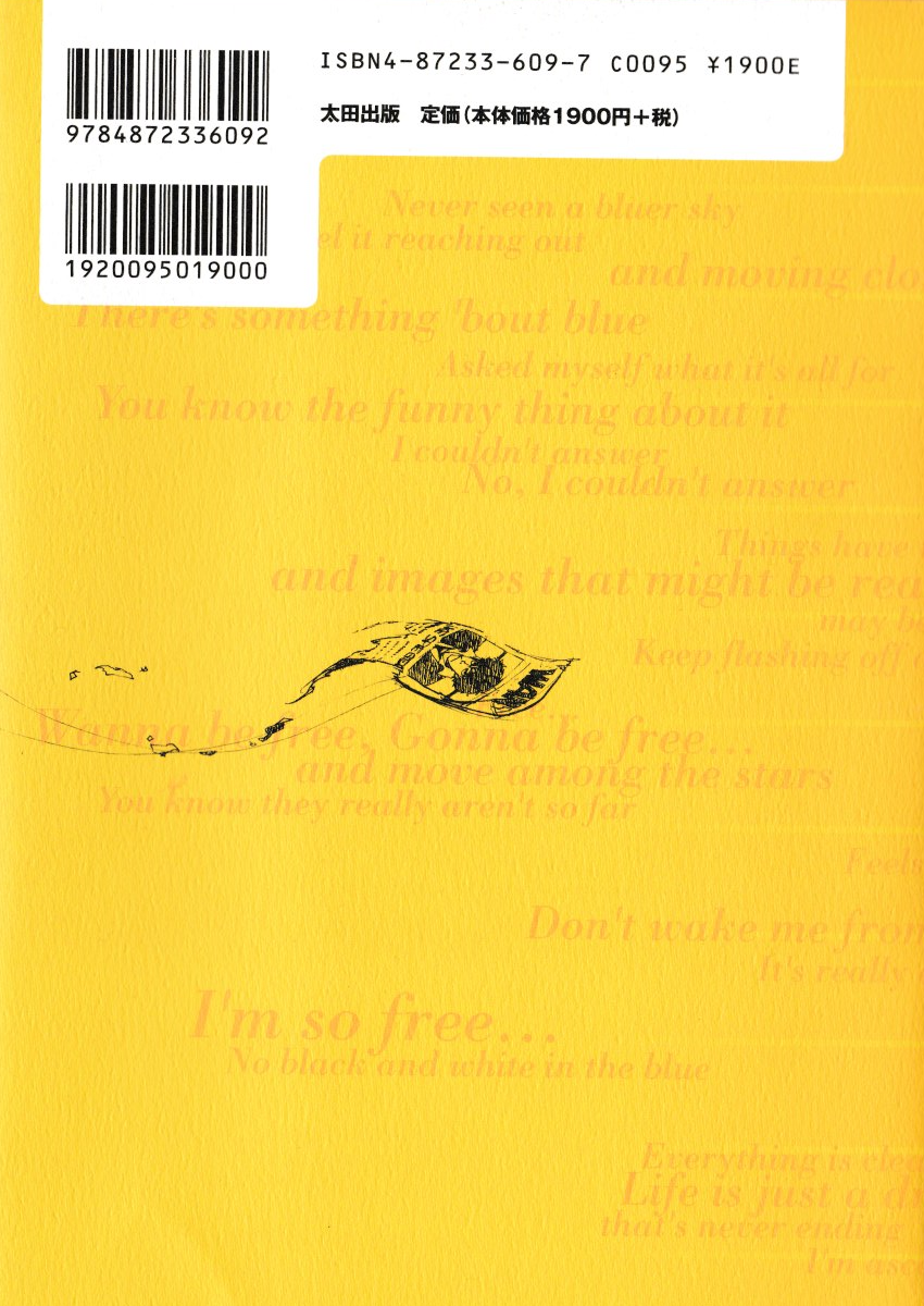
It tells you exactly what you'll find inside: Writers, actors, and series staff talking about this beloved science fiction anime. While some of this book is dedicated to introducing characters and key story concepts, the bulk of its pages are dedicated to essays written by three prominent Japanese subculture columnists, who give their thoughts, opinions, and interpretations of each of the series' 26 episodes and its interquel film. The book also features a roundtable discussion with the voice cast and an extended interview with Shinichiro Watanabe. The book is the sixth entry in the Library of Otakuology series, which is dedicated to analyzing notable science fiction anime, such as Space Runaway Ideon and Armored Trooper Votoms.
I was approached by someone to translate this book from Japanese to English. Inspired by their love of the series and hoping to hone my Japanese skills in order to take a proficiency test, I eagerly jumped at the opportunity. Everything seemed to be all well and good. Equal parts challenging and satisfying, I was able to develop a good routine and saw a noticeable improvement in my language skills. The client's requirement was simple: Make the translation as thorough and accurate to the original as possible. Easy enough.
Why a Website?
Which leads me to the million dollar question: How might we turn this book into a website?
Key Questions
How should the information be organized? How many pages should the site be split into? Are there any structural changes that need to be made?
How long should each page be? How do modern users read long-form websites? How do those habits differ from how they would read a book?
How might we give the website the same "feel" as the book?
talk about the visual design
Ideally, you'd just tear the book apart, scan each page, and then replace the Japanese text with English. That's how fan translations are usually done (Trivia: This kind of translation is known as a "scanslation"). One problem: It's not my book to destroy.
Plus, once I decided to build a website, it wouldn't make a lot of sense to go through all of that effort. Of course, the downside was that I didn't have any access to the images in the book. In addition to character and mechanical line art, the book's essays are also peppered with screenshots, and captions, that provide additional context and information. Thankfully, most of the captions didn't require their corresponding images to make sense, meaning that the loss of these screenshots wouldn't compromise the quality of the translation. The fact that most of the line art has been published elsewhere was also a huge boon.
Now comes the challenge: Despite being unable to use the book's visual assets, I still wanted the website's visual style to match the book's.
There are a few reasons for this, but the biggest factor is that I believe that a translation ought to be as faithful to the original as possible. Naturally, a translation will always differ from the original. That's unavoidable because a translation is, by nature, an interpretation. No matter how hard you try to capture the original, something will always be lost. And when you factor in the space constraints that print translations face, you end up losing even more. That can leave you holding on to whatever you can retain for dear life. But this isn't a translation case study, it's a UX one. So let's talk about the visual design.
My client asked me to be as thorough and accurate as I could. Why wouldn't that also apply to the visual design? After all, someone spent time creating the book's layout and graphics. And in order to maximize the reader's experience, I would need an engaging and accessible layout anyway.
Typography
Since the translation was going to be hosted on my portfolio site, I wanted continuity with my UX portfolio. In order to accomplish this, the translation's site uses the same typography system as my main site's.
Visual Design
Lorem ipsum dolor sit amet, consectetur adipiscing elit. Suspendisse varius enim in eros elementum tristique. Duis cursus, mi quis viverra ornare, eros dolor interdum nulla, ut commodo diam libero vitae erat. Aenean faucibus nibh et justo cursus id rutrum lorem imperdiet. Nunc ut sem vitae risus tristique posuere.
Background Image
Lorem ipsum dolor sit amet, consectetur adipiscing elit. Suspendisse varius enim in eros elementum tristique. Duis cursus, mi quis viverra ornare, eros dolor interdum nulla, ut commodo diam libero vitae erat. Aenean faucibus nibh et justo cursus id rutrum lorem imperdiet. Nunc ut sem vitae risus tristique posuere.