Overview
A good portfolio is a key component of landing a good job and with changing design trends, it can be difficult to keep it looking modern, especially when you've already got a job.
Digital designer and illustrator Brian Paul was, unfortunately, one such case- someone who hadn't had the time to update his site while working full-time. It was serendipity that he happened to be looking to refresh his portfolio when I approached him about this project.
The goal was to build a portfolio website that highlighted not only his work, but his process and also embodied his personal style and personality.
Target Audience
- HR recruiters and potential employers
- Users looking to hire Brian for commissions
My Role
- Conducting research to define the direction of the project
- Using Figma to create deliverables, wireframes, and prototypes
- Conducting user testing via Zoom and Maze
The Challenge

Brian has a portfolio site, but it lacks features like case studies and a resume. My challenge was to organize the content and use it to create a site that had a modern feel and gave a sense of who Brian is and his design process.
The Solution

Brian has a portfolio site, but it lacks features like case studies and a resume. My challenge was to organize the content and use it to create a site that had a modern feel and gave a sense of who Brian is and his design process.
Research
In order to determine what makes a successful portfolio, I wanted to look at examples of strong portfolio sites to define what common traits they shared. Additionally, in order to better meet the needs of our users, I also wanted to explore what their ideal experience might look like.
Competitive Analysis
I scoured the internet, looking through dozens of lists of top design portfolios in order to find examples that I thought demonstrated different approaches to how to structure a portfolio. By doing a SWOT (Strengths, Weaknesses, Opportunities, Threats) analysis of three of these sites, I was able to glean a few key characteristics of a successful portfolio website:
- Must have a clear separation between types of project
- Must have a consistent layout that creates cohesion throughout the site
- Must feature visual design that is both eye-catching and consistent with the designer's style
Juliette van Rhyn


Shanti Sparrow


Taylor Dunham


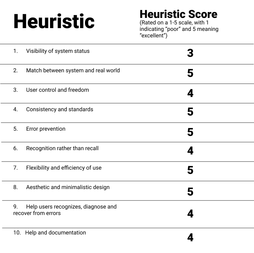
Heuristic Evaluation
While these findings were valuable, it also struck me that many of the portfolios on these lists were from designers who had decades of experience. Brian simply wasn't at that level yet, and in order to get him there, I'd also have to study the portfolios of
up-and-coming designers. Thus, I reached out to my mentor for examples of UX portfolio websites from former students that he thought were particularly
strong. I conducted a heuristic evaluation on two websites in order to see how their designs helped guide users to their desired information. In doing so, I was able to derive some requirements that our design would need to succeed:
- Clear and consistent navigation with multiple paths to their desired pages
- Case studies with a balance between images and discussion of his process
- A clear and compelling call to action
Daniel Korpai

Michelle Park


User Persona

Jen Whalen
Age: 42
Location: Ann Arbor, MI
Hobbies: Reading, exercising
Occupation: HR Recruiter
Education: College graduate
Brief Bio:
Jen is a veteran HR recruiter who works for an employment agency that specializes in recruiting for tech. She is organized, personable, and thorough. During the pandemic, she’s gotten into exercising at home and has always enjoyed kicking back with a good book and a glass of wine.
Behaviors
- Thanks to her experience, is able to quickly tell whether or not a candidate is a good fit for a job
- Values organization in her job because of the high number of resumes and portfolios she’s looking at
- Has a high success rate of finding good talent that eventually gets an interview and/or gets hired
- Likes seeing interesting visual design, but is more focused on finding what she needs
- Stays abreast of modern design trends because it helps her do her job more effectively
Goals/ Pain Points
- Wants to find the right candidate for her job and does her best to find someone who is a perfect fit
- - Because of the volume of resumes and portfolios she has to view for different clients, she doesn’t have a lot of time to spend on each candidate in the initial phases of evaluating them
- - Scans resumes for key terms and will move on if she doesn’t
see them
Storyboard
Since we'd determined that a core part of our audience is HR recruiters, it was necessary to consider how they might interact with this portfolio. HR recruiters are often reviewing many candidates for one opening and thus see a lot of portfolios. This was at the core of how we designed the project - because users couldn't afford a lot of time to peruse the site, it had to be designed to let them find what they were looking for as quickly and efficiently as possible. It also meant that the site had to have design elements that would leave an impression on users.

User Flow Chart
Using what I learned from imagining my persona's experience, I was able to create user flows from which I could derive a sitemap.

Development
After considering multiple development paths, we decided that we wanted Brian's presentation design and his freelance illustration design to be featured in equal measure. This meant that we had to come up with a design that would allow us to present both in a way that felt both appropriate for the medium and consistent with other pages on the site. We also wanted an idea to tie both parts together that also had a unique feel to it.
Visual Evolution
Design Sketches
After some sketching, I came up with the idea of a splash navigation section at the top of the home page built around the idea of a "right brain/left brain" split. Clicking the right brain would lead to Brian's case studies, which would talk about his design process. The left brain would take users to Brian's more creative work, his freelance illustrations, which would also talk a little bit about each featured piece. Finally, clicking on his face would take users to an about page that would highlight his interests, skills, and feature a full version of his resume.


Wireframes

In order to create a natural visual hierarchy and a sense of balance, I decided to apply a consistent layout across each page, with individual sections being placed in alternating colored boxes. This would allow certain sections to be highlighted without being too aggressive. The header and footer both feature calls to action and there are multiple paths to each page. These traits contribute to a simple, but modern design that ensured ease of navigation and provided breathing room.
Visual Design and Branding

Testing and Revisions
Conducting user testing lead to several key discoveries. While users found the site to be easy to navigate and clearly organized, there was also confusion regarding some wording. It was also found that the call to action button on the header didn't have enough context to justify its presence. The margins on the site also felt outdated. In order to address these issues, several revisions were made:
- Header bar replaces text links with an expandable menu. This gave the header a more balanced feel that would also
work well on mobile. - Unclear language like "projects" and "commissions" was replaced with words like "case studies" and "illustrations," respectively to more clearly indicate the contents of each page.
- Splash navigation was revised to more clearly demonstrate what it was
Reflections
Successes
- Learned about working in an Agile environment
- Gained valuable experience conducting research, designing, and testing
- Greatly enjoyed doing sketching activities
- Designed a site that has a lot of potential for refinement and growth
Opportunities
- Be more confident and ambitious with design decisions
- Vary types of research
- Improve time management
- Challenge self to try more ambitious and complex projects next time